Headteachers everywhere experience an anguishing few hours on results day trying to get a feel for how well their school has done. In the old days it was somewhat easier – quickly calculate the percentage of pupils’ five or more A* to C and, assuming nothing much had changed, compare that with last year’s results. Then have a quick look at English and maths, some individual pupils and head off to do the press release and call the chair of governors.
However, with so much change to qualifications and performance measures in 2018, getting that sense of how this year compares to last is much more difficult.
Attainment 8 will change this year because of reformed GCSE grades and changes to entry patterns and so can’t be compared with last year. There is a completely new EBacc measure based on points instead of passing a threshold so that’s no help either.
Also, I hope that we all know by now that it isn’t possible to know a Progress 8 score on results day – we have to wait for the Department for Education (DfE) to process everyone’s results first. Fortunately, several providers such as SISRA now encourage schools to share their data to get a rough idea of their Progress 8 score within a few days. This is a great example of how schools can achieve something really powerful when they collaborate.
The only measure which remains unaffected between 2017 and 2018 is the “Basics” measure. With mathematics, English language and English literature now in their second year of reform, we can at least compare the percentages of pupils getting a grade 5 in both English and maths with last year (or a grade 4 in both which is a better comparator for the former C grade).
But even there we have to be careful. There is a phenomenon which follows qualification reform called the “sawtooth effect” – when a qualification is brand new there may be an initial drop in performance but as teachers and pupils become increasingly familiar with it, performance can increase over time.
It is perfectly understandable for heads to be exercised by all these measures. They are the numbers which end up in performance tables and Ofsted summaries. They are the numbers which end up in the media and which are seized upon by journalists. But they aren’t the best way to understand what’s really gone on.
The problem is they jumble lots of qualifications together in a set of averages, and this can disguise really important details at school level. No single number can accurately describe how a school has performed in any case.
In my opinion, the most useful type of analysis for teachers and school leaders is to compare how pupils have fared in an individual subject against all pupils nationally who took the same subject.
There are two main ways to do this – using subject value added or transition matrices. Both of these compare performance against prior attainment. The maths element of Progress 8 is an example of value-added. My preference is transition matrices because they show the whole spread of performance, not just whether pupils are above or below average.
This transition matrix for maths in 2017 (see the chart, below) gives us a picture of what grades were plausible and reasonable. For example, it shows that nationally, very few pupils with 3a at key stage 2 managed to get a grade 5 or higher, and that anything below a grade 6 for 5a pupils would be unusual and disappointing. It also shows that quite a wide range of grades were achieved by pupils from similar starting points. Pupils with a 5c at key stage 2 ended up with a spread of results between grades 4 and 7.
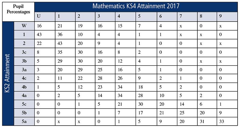
It is best to think about cumulative totals when using transition matrices to explore the performance of a subject. If we look at pupils who started with 4a, we can see that nationally two per cent achieved a grade 8 or higher, seven per cent achieved a grade 7 or higher and so on. By doing this we can guard against incorrect conclusions. One particular value in a school might be very high compared to the national picture and while this might be due to very good progress, it might also be due to pupils who perhaps should have attained the next grade up. Using cumulative totals prevents this error.
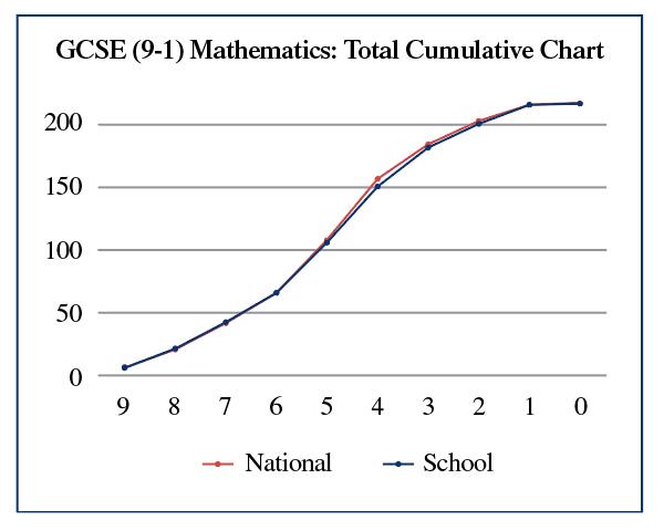
In order to make this simpler, ASCL has a toolkit for schools which automates this and displays the results graphically as a pair of lines – your school’s cumulative total against the equivalent national line.
In the example below you can see that the blue school line closely matches the national red line, but lags behind a little for pupils achieving at least a grade 4. The toolkit breaks this down by starting point to give you a set of these “snake graphs” for each level of prior attainment. It is possible to look at all the main GCSE subjects this way, and hence to compare like with like.
We have created a free online portal for the analysis of 2018 results. Schools simply need to upload their data-checking file which is published by the DfE at the end of September. Your data managers can also use this toolkit to help check the data, a pretty thankless but very important task.
However, there is one last problem to solve. While the DfE publishes transition matrices for each year, it doesn’t do this until February following the results – a delay of seven months. Schools, however, need this information in the autumn term (if there are issues emerging from this analysis then we need to know sooner rather than later).
But if schools collaborate with each other there is no reason why we can’t collect enough information to construct these matrices directly. So our toolkit lets us do just that. If you select the option to share your data (just grades and characteristics, no names of pupils or anything which would identify them) we can in theory have this ready at the end of September.
True accountability is all about individual pupils, not measures. Did each of our pupils achieve as well as we could reasonably have hoped in each of their subjects, and what can we learn from the data if they haven’t?
- Duncan Baldwin is deputy director of policy at the Association of School and College Leaders.
Further information
- You can register your school for the ASCL toolkit at www.smidreport.com. ASCL is grateful to SMID for making this entirely free.
- ASCL is running conferences in Manchester and London on getting to grips with accountability measures. Visit www.ascl.org.uk